
Our round-up of web design trends for 2022: image multilayers, bold colour, kinetic typography, scrollytelling, horizontal scrolling and background video, with Webflow tips.
Update, October 2026: Things have moved on since I wrote this. The newer approach is in The Top Web Design Trends for 2023. The rest of this post still stands as a record of how we did it at the time.
Every year a handful of web design trends start showing up in our project briefs. These are the ones we were seeing and building in Webflow in 2022, from layered imagery and bold colour to moving type, scrollytelling and sideways scrolling.
Imagery multilayers
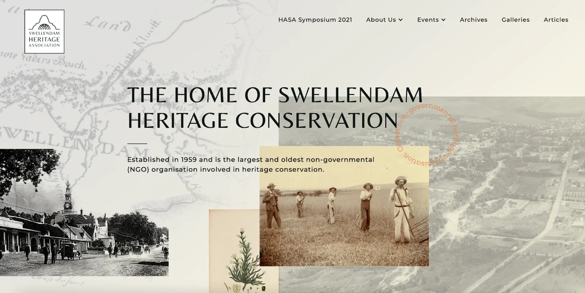
We’ve experienced this with some of Milk Moon Studio's own web designs, for example Swellendam Heritage Society, and found this leads to users spending more time exploring a website. For the Heritage Society we used CSS blend modes with a combo class in Webflow. We've created a short post on doing this with CSS blend modes and combo classes. Webflow does now support blend modes when you're layering elements, but support is a bit limited and we've found that while the built-in functionality is fine for now, some Webflow experts still prefer the freedom in our combo class method for the moment.
Fun contrast colours
Any millennials in the house? This one's for you!
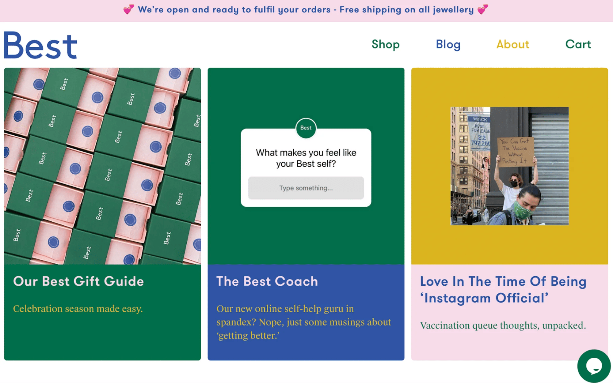
Colour is a basic tool that helps you get the user’s focus and also helps stimulate emotion.
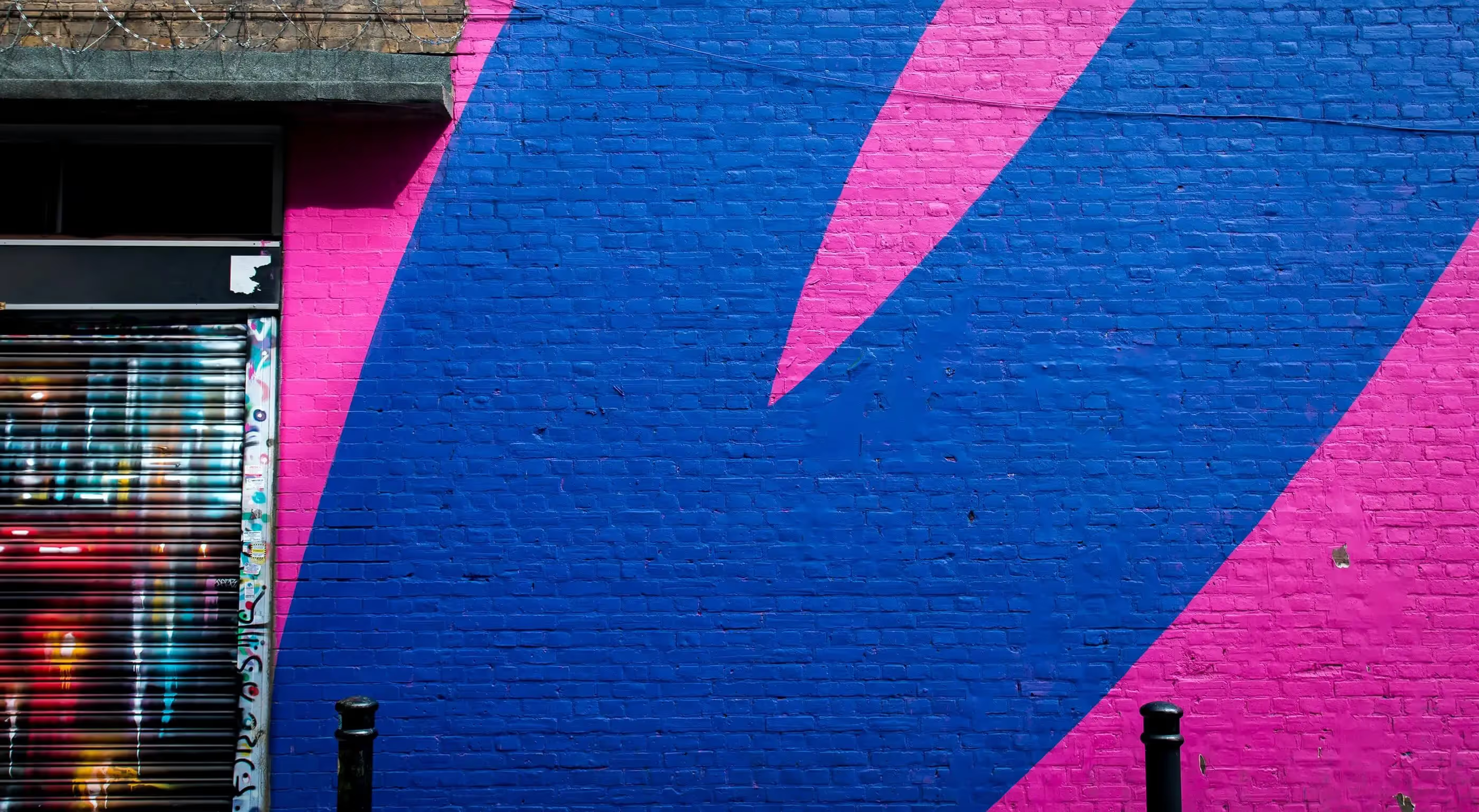
Usually targeted to a specific audience, this style has developed into a vibrant, popping web design aesthetic, filled with underground acid shapes, neon on black, bright contrast, and gradients. We're going to be pushing Webflow's wonderful features again here. The CMS allows for a Color field using a colour picker, hex etc. and the ability for as many Color fields as you can fit in your CMS item, which means you get to add wonderful matching or contrasting colours to your blog posts, team pages or e-commerce items with just a few clicks. For those who are a bit more daring, you can use scripts that pick up the colour from an image and use that in an element. You can find examples here or go hunt on stackoverflow.com.
Playfulness and nostalgia
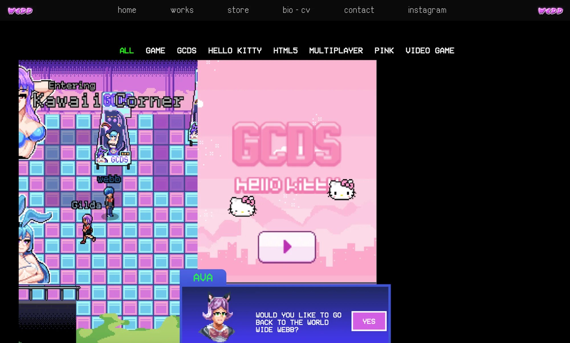
This approach calls for slowing things down, giving a more analog feel through typography and imagery, using classic image filters, retro fonts, blurriness, grain, textures, soft lighting, and pastel colour palettes. All of which are merely a few examples of practices web designers are using to create relatable experiences.
Typography animation / kinetic typography
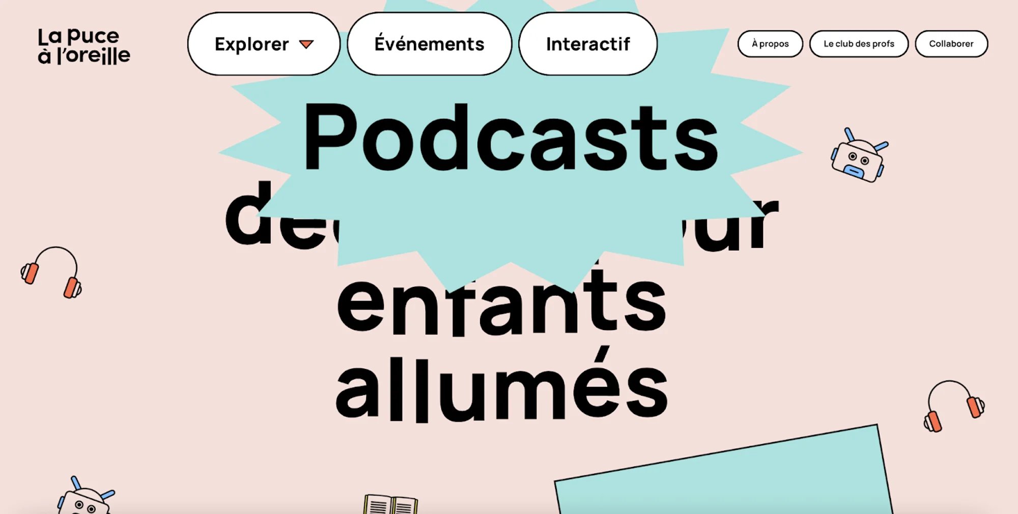
Moving text can capture attention, establish a tone, highlight important segments, and guide the user’s eyes through a page. If you're animating type in Webflow, our visual guide to easing functions in Webflow helps you pick the right motion curve. This is a trend that has in reality been around since the 1950s when feature films started using animated opening titles instead of static text.
Design for all
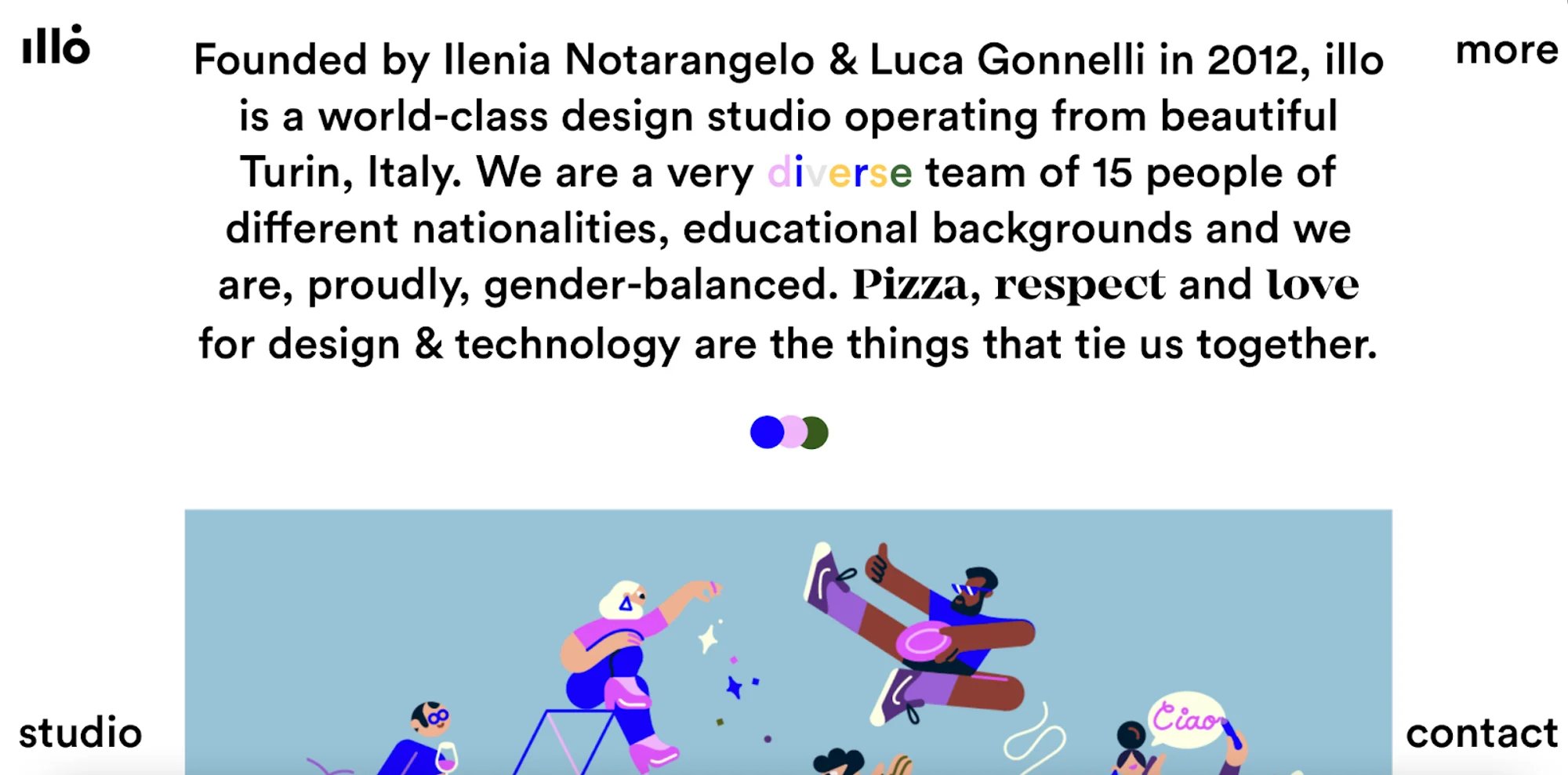
Inclusive design affects every step of a website design process, from strategic decision making regarding the website target audience, to its tone of voice, and personalisation, as well as defining the graphic language of your brand to accommodate all genders, viewpoints, experiences, and situations. Looking at inclusive design from other perspectives also means catering for a variety of disabilities by making your site more accessible, something every Webflow studio should strive for.
Giving another shoutout to Webflow, they've made great strides with more inclusive design: you can preview your project for different kinds of colour blindness, get warnings when elements do not have enough contrast or when you've skipped a heading level making it harder for screen readers to figure out what's going on, missing alt text, links that aren't descriptive enough etc, etc.
For more on tone, imagery etc, check out Webflow's short post on inclusive content and head over to Webflow University for some tips on making your site more accessible.
Scrollytelling
An increasingly popular way to make the most of a digital interface and convey an intricate story.
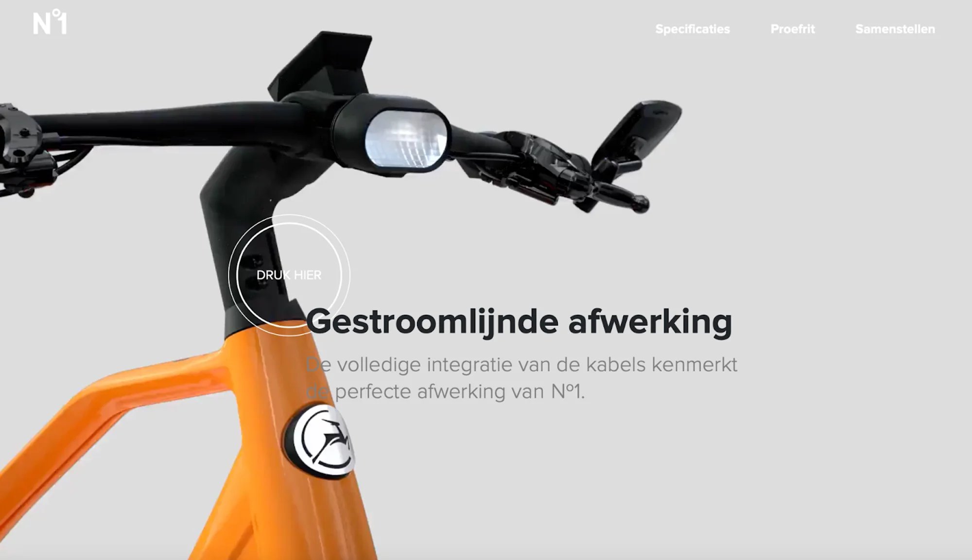
Visual effects that strive to captivate audiences, serving them engaging content on a silver platter. Scrollytelling is also referred to as “narrative visualisation”, a series of visual elements sequenced together, organised chronologically to convey a specific message to visitors.
Horizontal scrolling
A side scroll layout can lead to surprising interactions between texts and images.
This is especially true for portfolio websites, catalogs, maps, and the like. Discovering projects, exploring cities, and visiting online galleries is far more engaging with sideways navigation. When done right, horizontal scrolling can make a website more appealing, fun, and memorable, as the NOVA+ example below beautifully illustrates.
Here we have to say Webflow can be an absolute pain in the ass as the platform does not like scrolling sideways, but hey, who's to say you can't hack it a bit, we did it for NOVA+, so definitely something that is easy to do with Webflow design if the need exists. Have a look at the NOVA+ project, where we've used two different methods. The first relies on mouse position, scrolling left or right based on where you hover over the section and the second forces you to scroll through the section as you move down the page.
Background video
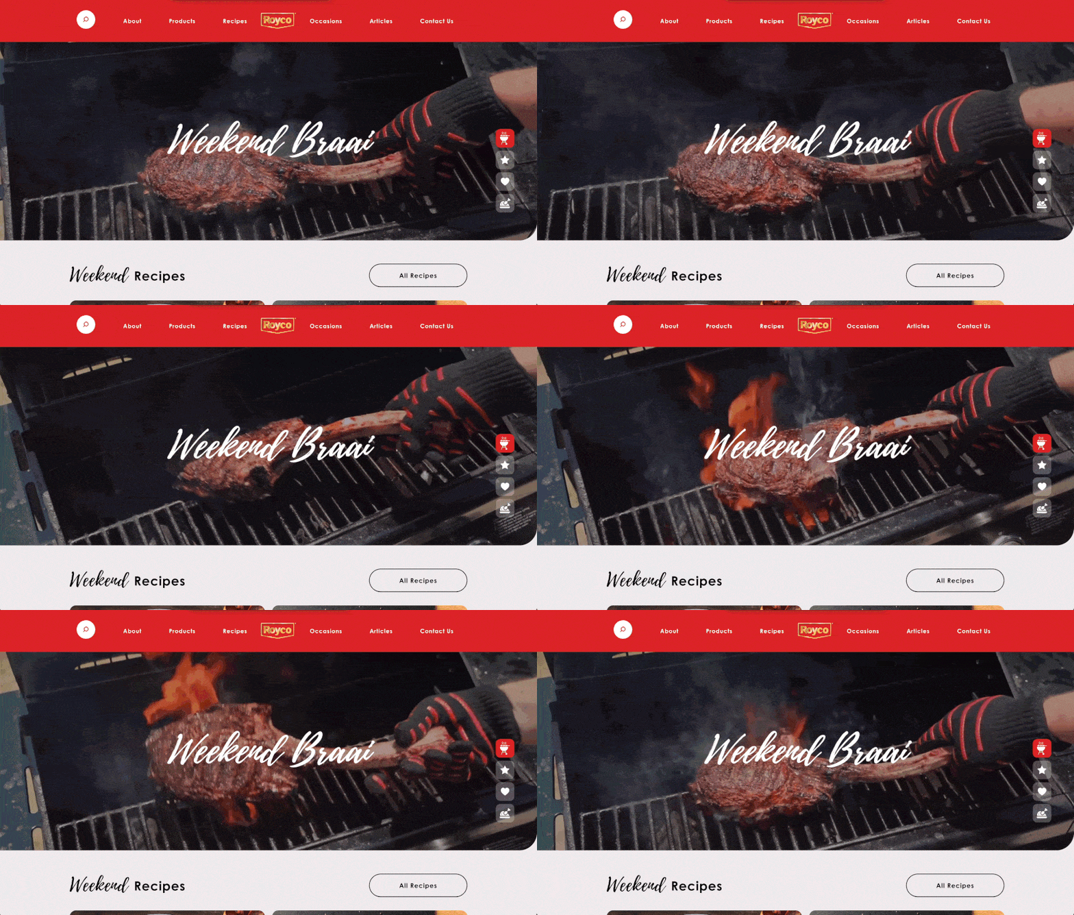
What's not to like, and with advances in both broadband speed and the fact that 4G and 5G are rolling out basically everywhere, having a nice video looping behind your content just makes sense. We've even created a how-to on adding Background Videos to CMS items in Webflow, something that's not supported straight out of the box. So head to our how-to on CMS-powered background videos in collection lists if you're interested. There's also a newer method that uses the Custom Element, which we cover in our post on CMS-powered background videos with the Custom Element.