
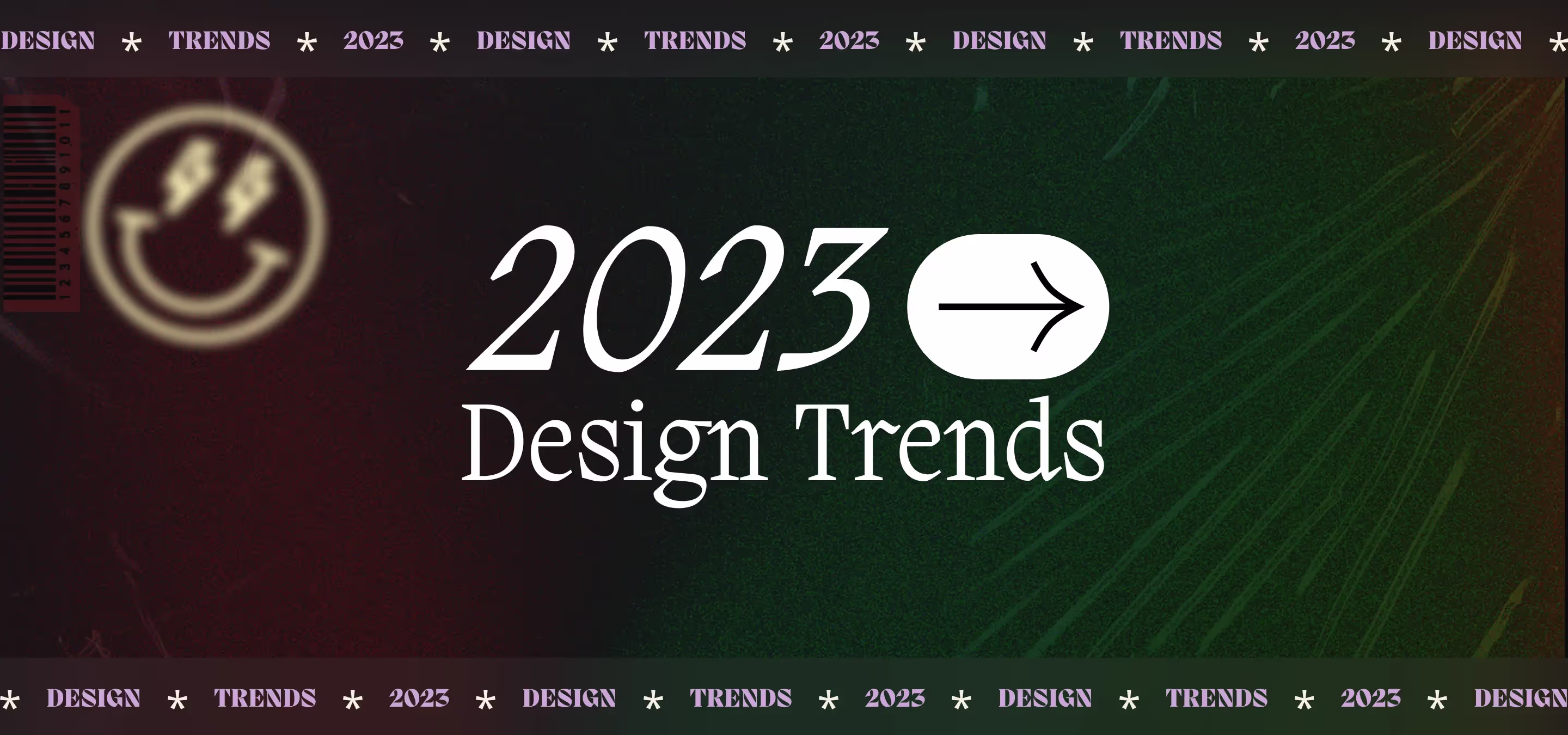
Explore the latest web design trends for 2023. Milk Moon Studio is here to round up some of our favorite trends, including mobile-first design, micro interactions, 3D and layered design, bold typography, Webflow, asymmetrical layouts, interactive storytelling, dark mode, glitch art, accessibility and 3D and AR elements.
First and foremost, we must mention the importance of mobile-first design, it's the thing you have to mention every single time, kinda. With more and more people accessing the internet on their smartphones, it's crucial that your website looks and functions just as well on a small screen as it does on a desktop. This means designing with a focus on simplicity, minimalism, and easy navigation.
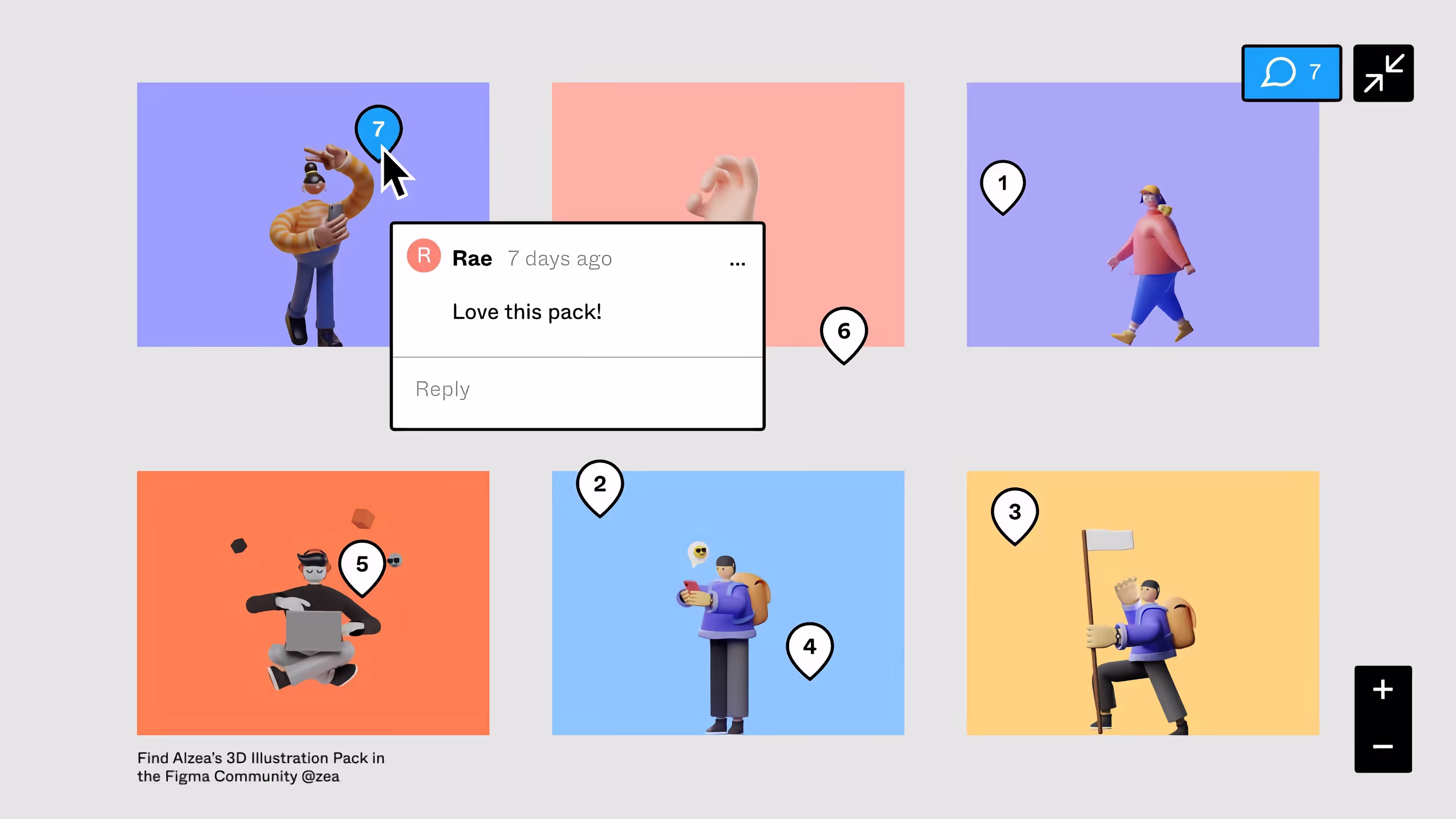
Another trend that's on the rise is the use of micro interactions. These small, subtle animations can add a touch of personality to your website and make it more engaging for users. Think of a button that bounces when clicked or a menu that slides out smoothly. These micro interactions can be used to enhance the user experience and make your website feel more alive.
<div style="padding:71.3% 0 0 0;position:relative;"><iframe src="https://player.vimeo.com/video/797614419?h=57777d8d90&title=0&byline=0&portrait=0" style="position:absolute;top:0;left:0;width:100%;height:100%;" frameborder="0" allow="autoplay; fullscreen; picture-in-picture" allowfullscreen></iframe></div><script src="https://player.vimeo.com/api/player.js"></script>
As for aesthetics, we're seeing a shift away from flat design towards a more 3D and layered look. This can be achieved by using subtle gradients, drop shadows, and other design elements that add depth and dimension to a website. Think of it as a way to bring your website to life and make it more visually interesting.
Speaking of visual interest, we're also seeing an increase in the use of bold typography. Large, attention-grabbing headlines and text can help make your website stand out and grab the user's attention. This is a great way to add a touch of personality to your website and make it more memorable.
<div style="padding:75% 0 0 0;position:relative;"><iframe src="https://player.vimeo.com/video/797614766?h=7023666b3a&title=0&byline=0&portrait=0" style="position:absolute;top:0;left:0;width:100%;height:100%;" frameborder="0" allow="autoplay; fullscreen; picture-in-picture" allowfullscreen></iframe></div><script src="https://player.vimeo.com/api/player.js"></script>
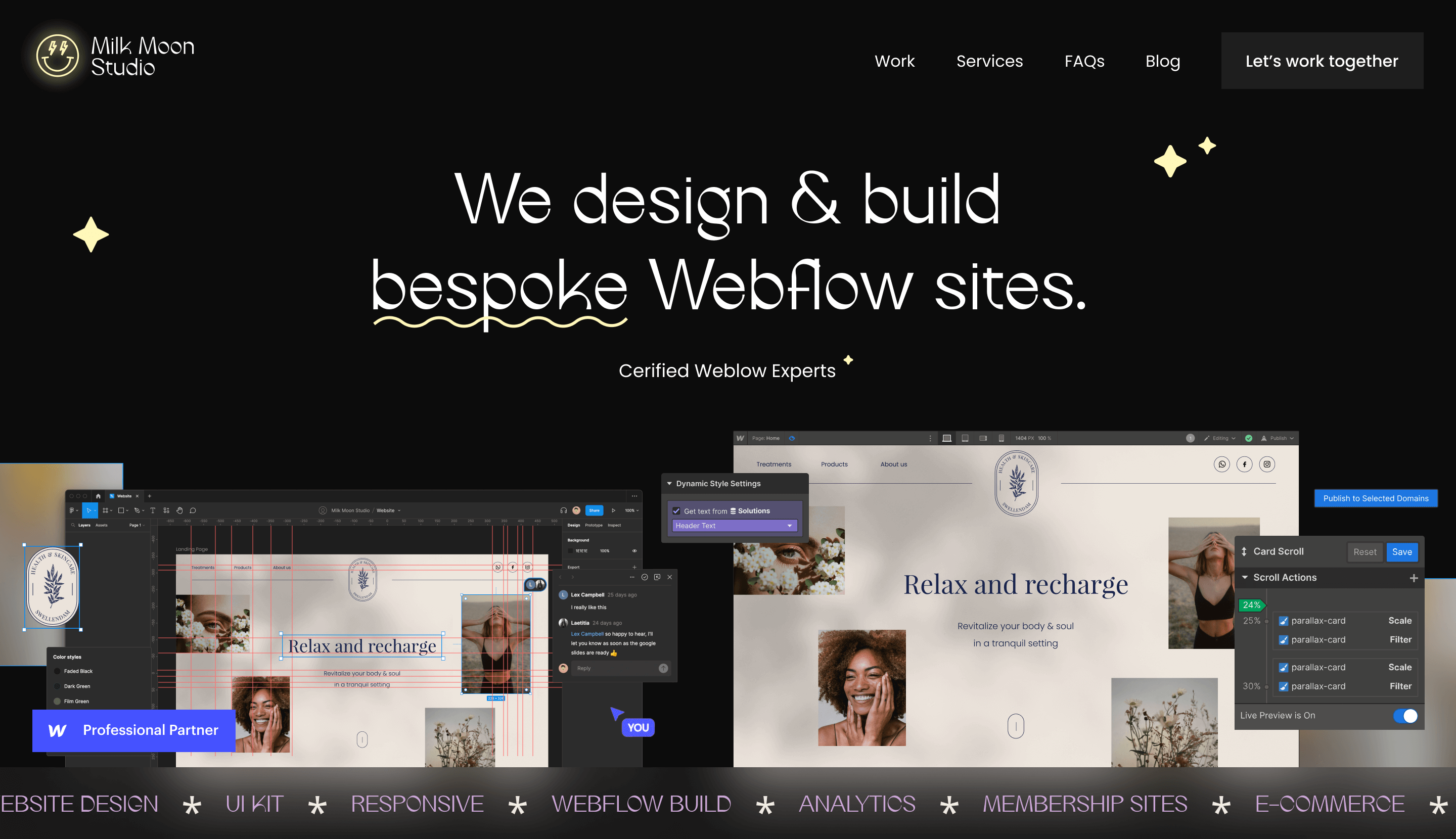
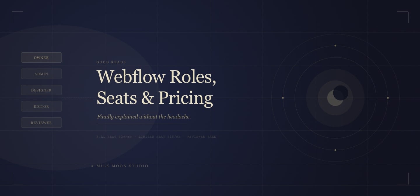
We must mention the importance of Webflow in web design. As a web design and development agency, we specialize in building websites on Webflow. It's a powerful tool that allows us to design and develop websites in a way that's both visually stunning and technically sound. With its intuitive drag-and-drop interface, it's easy to create beautiful, responsive websites that look great on any device.
<blockquote class="instagram-media" data-instgrm-permalink="https://www.instagram.com/p/CnCl3T5u4en/?utm_source=ig_embed&utm_campaign=loading" data-instgrm-version="14" style=" background:#FFF; border:0; border-radius:3px; box-shadow:0 0 1px 0 rgba(0,0,0,0.5),0 1px 10px 0 rgba(0,0,0,0.15); margin: 1px; max-width:540px; min-width:326px; padding:0; width:99.375%; width:-webkit-calc(100% - 2px); width:calc(100% - 2px);"><div style="padding:16px;"> <a href="https://www.instagram.com/p/CnCl3T5u4en/?utm_source=ig_embed&utm_campaign=loading" style=" background:#FFFFFF; line-height:0; padding:0 0; text-align:center; text-decoration:none; width:100%;" target="_blank"> <div style=" display: flex; flex-direction: row; align-items: center;"> <div style="background-color: #F4F4F4; border-radius: 50%; flex-grow: 0; height: 40px; margin-right: 14px; width: 40px;"></div> <div style="display: flex; flex-direction: column; flex-grow: 1; justify-content: center;"> <div style=" background-color: #F4F4F4; border-radius: 4px; flex-grow: 0; height: 14px; margin-bottom: 6px; width: 100px;"></div> <div style=" background-color: #F4F4F4; border-radius: 4px; flex-grow: 0; height: 14px; width: 60px;"></div></div></div><div style="padding: 19% 0;"></div> <div style="display:block; height:50px; margin:0 auto 12px; width:50px;"><svg width="50px" height="50px" viewBox="0 0 60 60" version="1.1" xmlns="https://www.w3.org/2000/svg" xmlns:xlink="https://www.w3.org/1999/xlink"><g stroke="none" stroke-width="1" fill="none" fill-rule="evenodd"><g transform="translate(-511.000000, -20.000000)" fill="#000000"><g><path d="M556.869,30.41 C554.814,30.41 553.148,32.076 553.148,34.131 C553.148,36.186 554.814,37.852 556.869,37.852 C558.924,37.852 560.59,36.186 560.59,34.131 C560.59,32.076 558.924,30.41 556.869,30.41 M541,60.657 C535.114,60.657 530.342,55.887 530.342,50 C530.342,44.114 535.114,39.342 541,39.342 C546.887,39.342 551.658,44.114 551.658,50 C551.658,55.887 546.887,60.657 541,60.657 M541,33.886 C532.1,33.886 524.886,41.1 524.886,50 C524.886,58.899 532.1,66.113 541,66.113 C549.9,66.113 557.115,58.899 557.115,50 C557.115,41.1 549.9,33.886 541,33.886 M565.378,62.101 C565.244,65.022 564.756,66.606 564.346,67.663 C563.803,69.06 563.154,70.057 562.106,71.106 C561.058,72.155 560.06,72.803 558.662,73.347 C557.607,73.757 556.021,74.244 553.102,74.378 C549.944,74.521 548.997,74.552 541,74.552 C533.003,74.552 532.056,74.521 528.898,74.378 C525.979,74.244 524.393,73.757 523.338,73.347 C521.94,72.803 520.942,72.155 519.894,71.106 C518.846,70.057 518.197,69.06 517.654,67.663 C517.244,66.606 516.755,65.022 516.623,62.101 C516.479,58.943 516.448,57.996 516.448,50 C516.448,42.003 516.479,41.056 516.623,37.899 C516.755,34.978 517.244,33.391 517.654,32.338 C518.197,30.938 518.846,29.942 519.894,28.894 C520.942,27.846 521.94,27.196 523.338,26.654 C524.393,26.244 525.979,25.756 528.898,25.623 C532.057,25.479 533.004,25.448 541,25.448 C548.997,25.448 549.943,25.479 553.102,25.623 C556.021,25.756 557.607,26.244 558.662,26.654 C560.06,27.196 561.058,27.846 562.106,28.894 C563.154,29.942 563.803,30.938 564.346,32.338 C564.756,33.391 565.244,34.978 565.378,37.899 C565.522,41.056 565.552,42.003 565.552,50 C565.552,57.996 565.522,58.943 565.378,62.101 M570.82,37.631 C570.674,34.438 570.167,32.258 569.425,30.349 C568.659,28.377 567.633,26.702 565.965,25.035 C564.297,23.368 562.623,22.342 560.652,21.575 C558.743,20.834 556.562,20.326 553.369,20.18 C550.169,20.033 549.148,20 541,20 C532.853,20 531.831,20.033 528.631,20.18 C525.438,20.326 523.257,20.834 521.349,21.575 C519.376,22.342 517.703,23.368 516.035,25.035 C514.368,26.702 513.342,28.377 512.574,30.349 C511.834,32.258 511.326,34.438 511.181,37.631 C511.035,40.831 511,41.851 511,50 C511,58.147 511.035,59.17 511.181,62.369 C511.326,65.562 511.834,67.743 512.574,69.651 C513.342,71.625 514.368,73.296 516.035,74.965 C517.703,76.634 519.376,77.658 521.349,78.425 C523.257,79.167 525.438,79.673 528.631,79.82 C531.831,79.965 532.853,80.001 541,80.001 C549.148,80.001 550.169,79.965 553.369,79.82 C556.562,79.673 558.743,79.167 560.652,78.425 C562.623,77.658 564.297,76.634 565.965,74.965 C567.633,73.296 568.659,71.625 569.425,69.651 C570.167,67.743 570.674,65.562 570.82,62.369 C570.966,59.17 571,58.147 571,50 C571,41.851 570.966,40.831 570.82,37.631"></path></g></g></g></svg></div><div style="padding-top: 8px;"> <div style=" color:#3897f0; font-family:Arial,sans-serif; font-size:14px; font-style:normal; font-weight:550; line-height:18px;">View this post on Instagram</div></div><div style="padding: 12.5% 0;"></div> <div style="display: flex; flex-direction: row; margin-bottom: 14px; align-items: center;"><div> <div style="background-color: #F4F4F4; border-radius: 50%; height: 12.5px; width: 12.5px; transform: translateX(0px) translateY(7px);"></div> <div style="background-color: #F4F4F4; height: 12.5px; transform: rotate(-45deg) translateX(3px) translateY(1px); width: 12.5px; flex-grow: 0; margin-right: 14px; margin-left: 2px;"></div> <div style="background-color: #F4F4F4; border-radius: 50%; height: 12.5px; width: 12.5px; transform: translateX(9px) translateY(-18px);"></div></div><div style="margin-left: 8px;"> <div style=" background-color: #F4F4F4; border-radius: 50%; flex-grow: 0; height: 20px; width: 20px;"></div> <div style=" width: 0; height: 0; border-top: 2px solid transparent; border-left: 6px solid #f4f4f4; border-bottom: 2px solid transparent; transform: translateX(16px) translateY(-4px) rotate(30deg)"></div></div><div style="margin-left: auto;"> <div style=" width: 0px; border-top: 8px solid #F4F4F4; border-right: 8px solid transparent; transform: translateY(16px);"></div> <div style=" background-color: #F4F4F4; flex-grow: 0; height: 12px; width: 16px; transform: translateY(-4px);"></div> <div style=" width: 0; height: 0; border-top: 8px solid #F4F4F4; border-left: 8px solid transparent; transform: translateY(-4px) translateX(8px);"></div></div></div> <div style="display: flex; flex-direction: column; flex-grow: 1; justify-content: center; margin-bottom: 24px;"> <div style=" background-color: #F4F4F4; border-radius: 4px; flex-grow: 0; height: 14px; margin-bottom: 6px; width: 224px;"></div> <div style=" background-color: #F4F4F4; border-radius: 4px; flex-grow: 0; height: 14px; width: 144px;"></div></div></a><p style=" color:#c9c8cd; font-family:Arial,sans-serif; font-size:14px; line-height:17px; margin-bottom:0; margin-top:8px; overflow:hidden; padding:8px 0 7px; text-align:center; text-overflow:ellipsis; white-space:nowrap;"><a href="https://www.instagram.com/p/CnCl3T5u4en/?utm_source=ig_embed&utm_campaign=loading" style=" color:#c9c8cd; font-family:Arial,sans-serif; font-size:14px; font-style:normal; font-weight:normal; line-height:17px; text-decoration:none;" target="_blank">A post shared by Webflow (@webflow)</a></p></div></blockquote> <script async src="//www.instagram.com/embed.js"></script>
In addition to these trends, we also expect to see more of the following over the next year.
- Asymmetrical layouts - Gone are the days of perfectly symmetrical websites. In 2023, we're likely to see more websites that use asymmetrical layouts to create visual interest and break up the monotony. This can be achieved by using different-sized elements, off-center alignments, and unexpected placement of elements on the page.
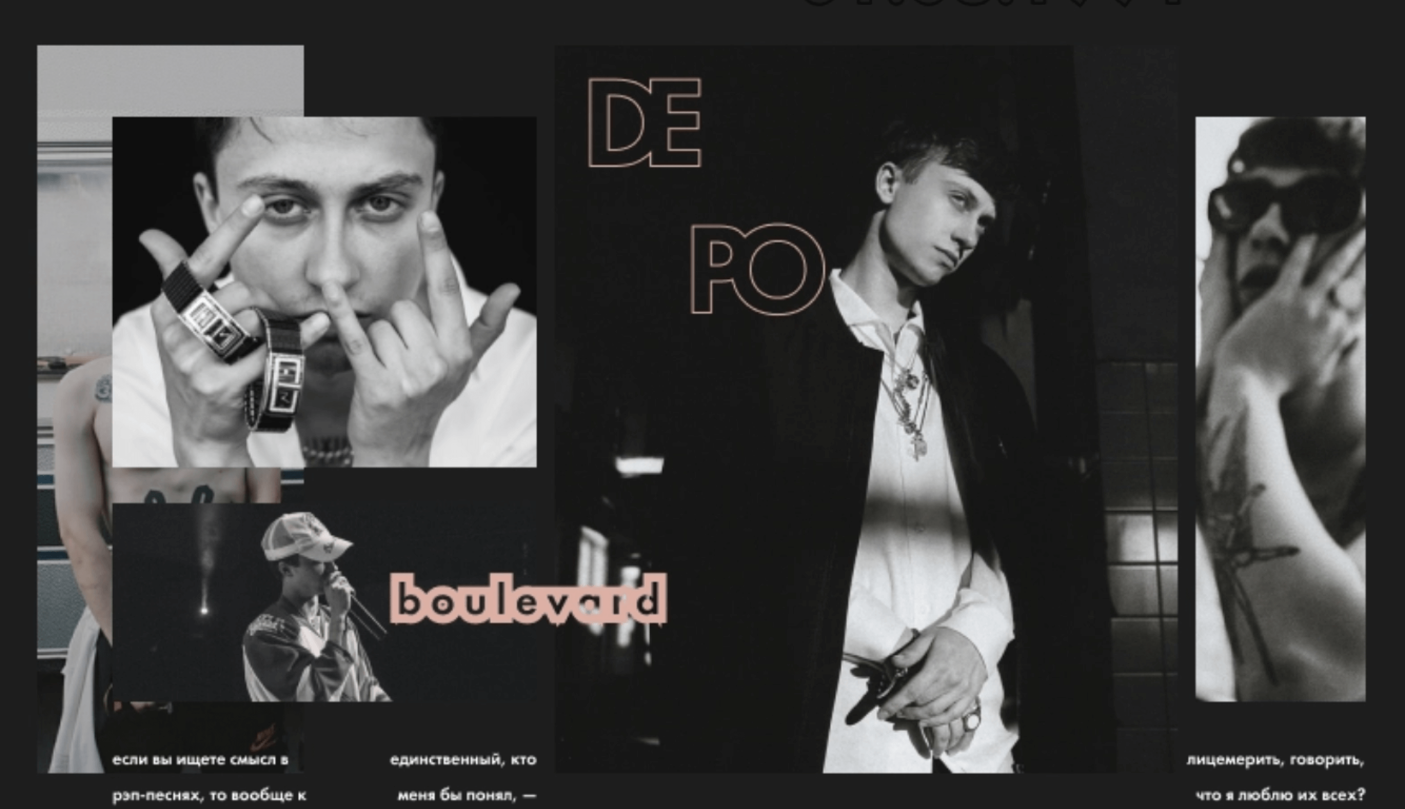
by kutovoyweb
- Interactive storytelling - This trend is all about using interactive elements, such as animations, videos, and parallax scrolling, to tell a story and engage the user. By using interactive storytelling, you can create a more immersive experience for the user and make your website more memorable.
- <div style="padding:65.33% 0 0 0;position:relative;"><iframe src="https://player.vimeo.com/video/797615734?h=475a0dca43&title=0&byline=0&portrait=0" style="position:absolute;top:0;left:0;width:100%;height:100%;" frameborder="0" allow="autoplay; fullscreen; picture-in-picture" allowfullscreen></iframe></div><script src="https://player.vimeo.com/api/player.js"></script>
- Dark mode - With the rise of dark mode on mobile devices, we're likely to see more websites that offer a dark mode option. This can be achieved by using dark backgrounds, light text, and muted colors. Not only is dark mode easy on the eyes, but it also makes your website stand out and look more modern.
- Glitch art - This trend is all about using glitch effects, such as pixelation, distortion, and noise, to create a visually interesting and edgy look. This can be achieved by using design elements such as broken lines, distorted images, and glitchy animations. Glitch art can be used to create a unique and memorable website that stands out from the crowd.
<div style="padding:75% 0 0 0;position:relative;"><iframe src="https://player.vimeo.com/video/797616421?h=aaa7ea1a74&title=0&byline=0&portrait=0" style="position:absolute;top:0;left:0;width:100%;height:100%;" frameborder="0" allow="autoplay; fullscreen; picture-in-picture" allowfullscreen></iframe></div><script src="https://player.vimeo.com/api/player.js"></script>
by Pauline D.
- Accessibility - As we head into 2023, accessibility is becoming more and more important. This means designing websites that are easy to use for everyone, regardless of their abilities. This includes using high-contrast colors, large text, and clear navigation. By designing with accessibility in mind, you can ensure that your website is inclusive and reaches a wider audience.
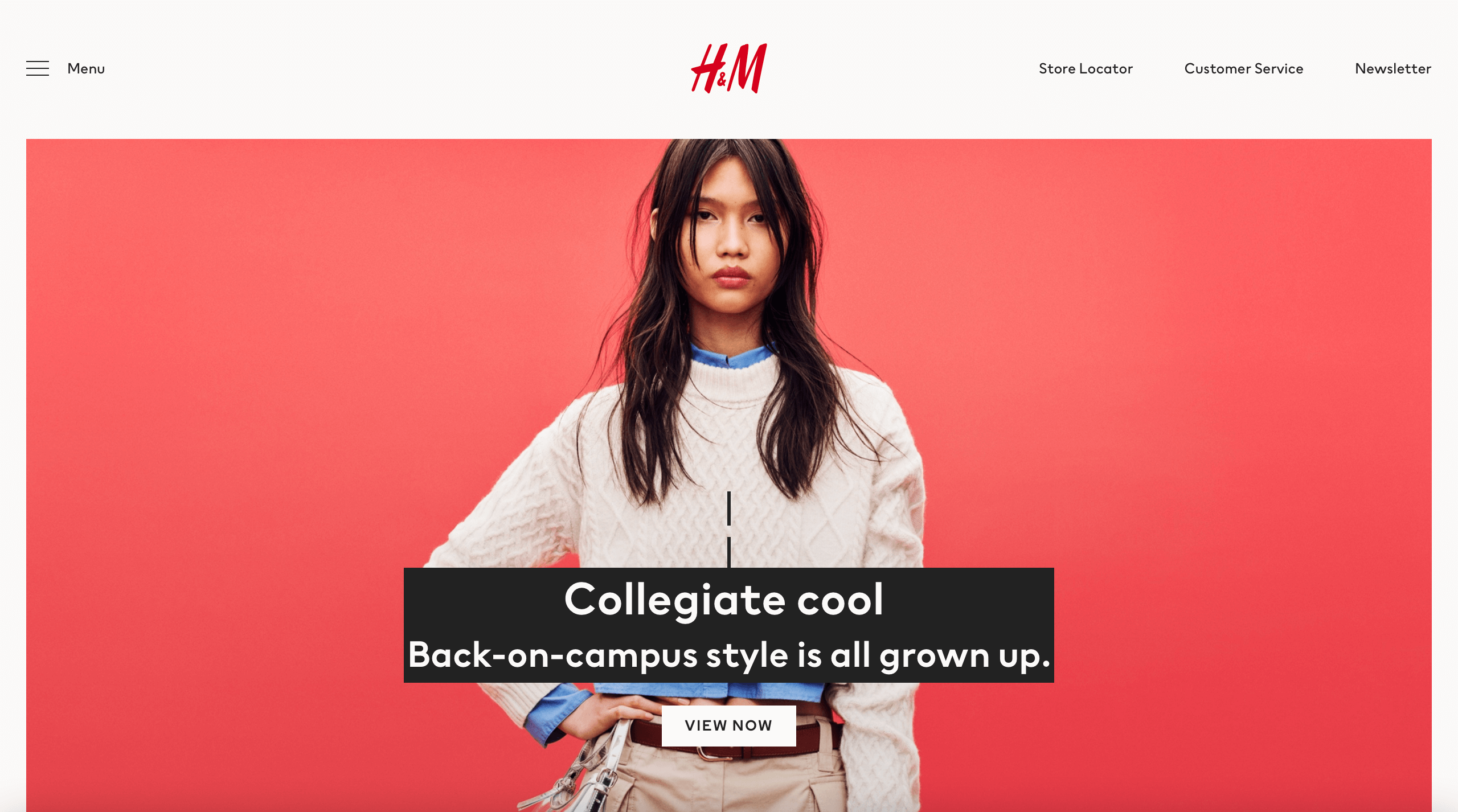
Enabled high contrast mode by H&M
- 3D and AR (Augmented Reality) - As technology advances, we will see more websites incorporating 3D and AR elements to create a more engaging and immersive experience. This can be achieved by using 3D models, animations, and even allowing users to view products in augmented reality. This will be a big trend in e-commerce as it allows customers to see the products in a more realistic way.
<div style="padding:71.3% 0 0 0;position:relative;"><iframe src="https://player.vimeo.com/video/797614419?badge=0&autopause=0&player_id=0&app_id=58479" frameborder="0" allow="autoplay; fullscreen; picture-in-picture" allowfullscreen style="position:absolute;top:0;left:0;width:100%;height:100%;" title="Fandhitya Giovani"></iframe></div><script src="https://player.vimeo.com/api/player.js"></script>


