
A plain-English web design glossary covering the website design terms and jargon clients ask us about most, from responsive design and wireframes to CMS, SSL and SEO.
To an untrained tech ear some terms can sound quite foreign. We’ve put together a glossary of some website terms and features to help you communicate with us as your web developer. Think of it as a plain-English guide to web design terms, website design terminology and the jargon that gets thrown around in project meetings. We curated these based on questions we get asked as a Webflow studio, so as we get more questions we’ll keep expanding the list, but naturally this list is not unique to Webflow designers and applies to everyone.
If you’re still deciding who to build with, here’s why you should choose a Webflow studio for your next website project, and what goes into the cost of a website.
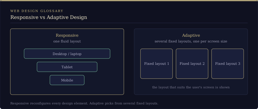
Adaptive design
The way in which a website is built determines how it appears on different devices. Adaptive design creates a website in several different layouts, each suited for different screen sizes.
Responsive design
Ensures that a website is displayed correctly no matter what device the user is viewing it on. Responsive websites are built in such a way that they adapt to different screen sizes, so the user gets the same quality and ease of use regardless of whether they’re browsing on desktop, mobile, or tablet.
Adaptive vs responsive
Responsive design will reconfigure all design elements whether it’s viewed on a desktop, laptop, tablet, or mobile phone. With adaptive design, different fixed layouts are created that adapt to the user’s screen size. As opposed to the more fluid responsive approach, adaptive design employs multiple sizes of a fixed design.
At Milk Moon we tend to lean toward a responsive design approach, but sometimes we mix it up. You might have an element that just won’t work on mobile and is therefore hidden on a mobile device and replaced with a more adaptive design for only that specific section.
Lightbox
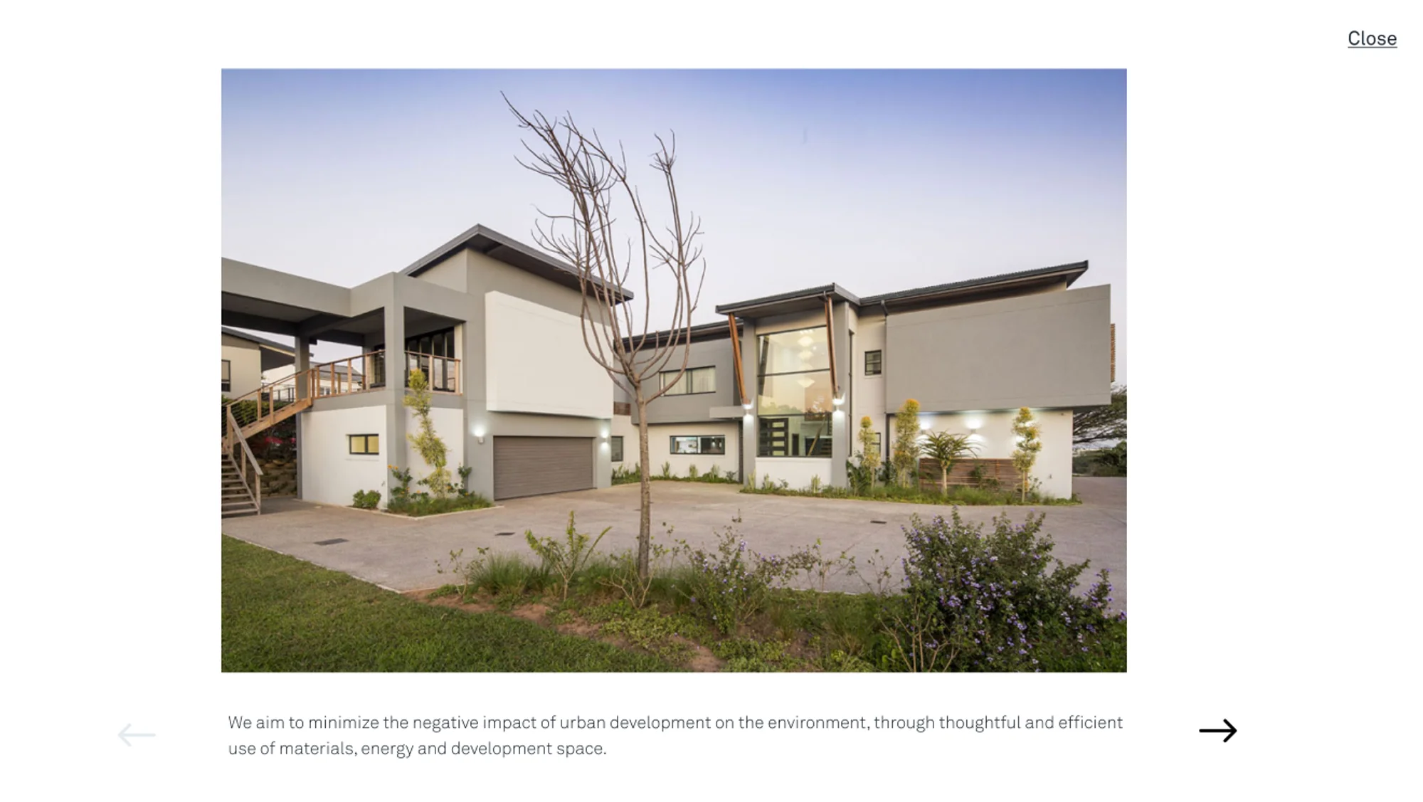
An immersive full-screen display for your photos, graphics, and videos.
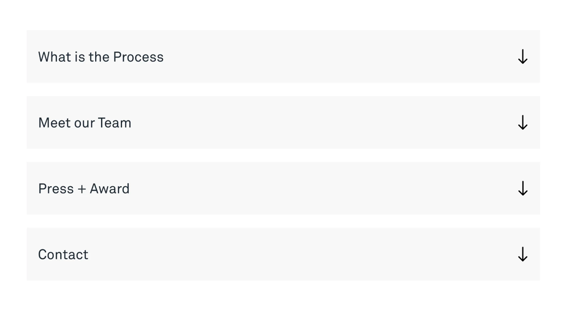
Accordions
The accordion is a graphical control element comprising a vertically stacked list of items, such as labels or thumbnails. An accordion is similar in purpose to a tabbed interface, a list of items where exactly one item is expanded into a panel.
Lazy load
Meaning images load when they appear on the screen, as opposed to all images on a page loading when the site is first opened. It’s one of the easiest ways to speed a page up (more on why that matters in our post on how page speed drives business success).
Lottie animation
A Lottie is an animation file format that enables designers to ship animations on any platform as easily as shipping static assets. They are small files that work on any device and can scale up or down without pixelation.
Nav bar
A navigation bar is a user interface element within a webpage that contains links to other sections of the website.

Content management system (CMS)
A CMS refers to an online system in which end-users can create, change and edit website content through the use of an editor so that non-developers can edit their content more easily.
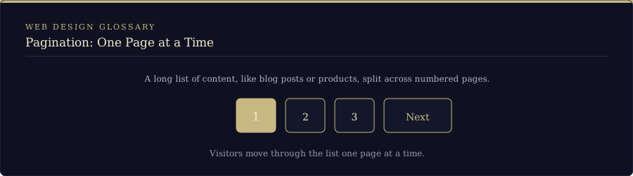
Pagination
Splitting a long list of content, like blog posts or products, across numbered pages so visitors can move through it one page at a time. If you want the page to stay put instead of jumping back to the top when someone clicks “next”, read more about our seamless pagination hack here.
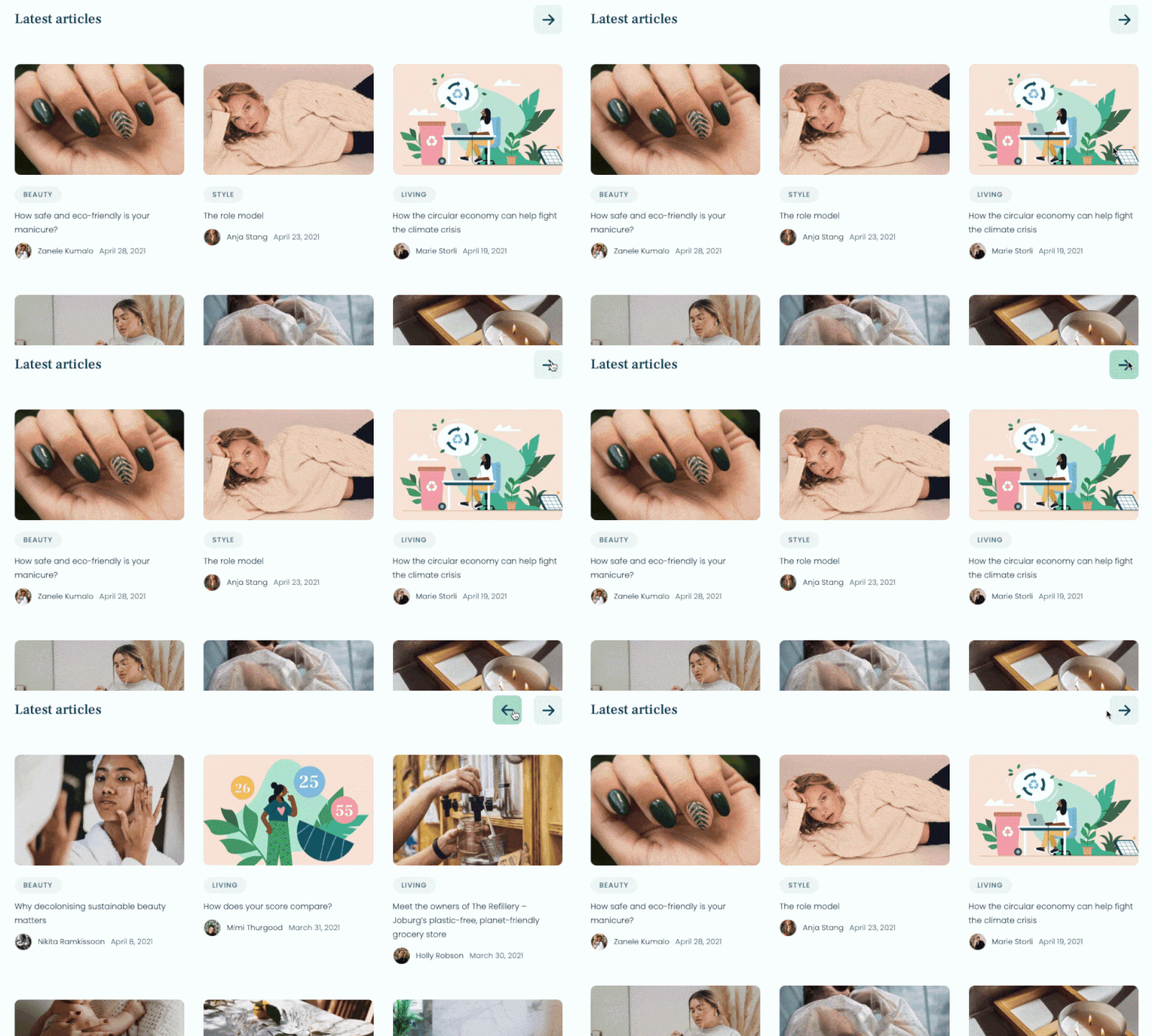
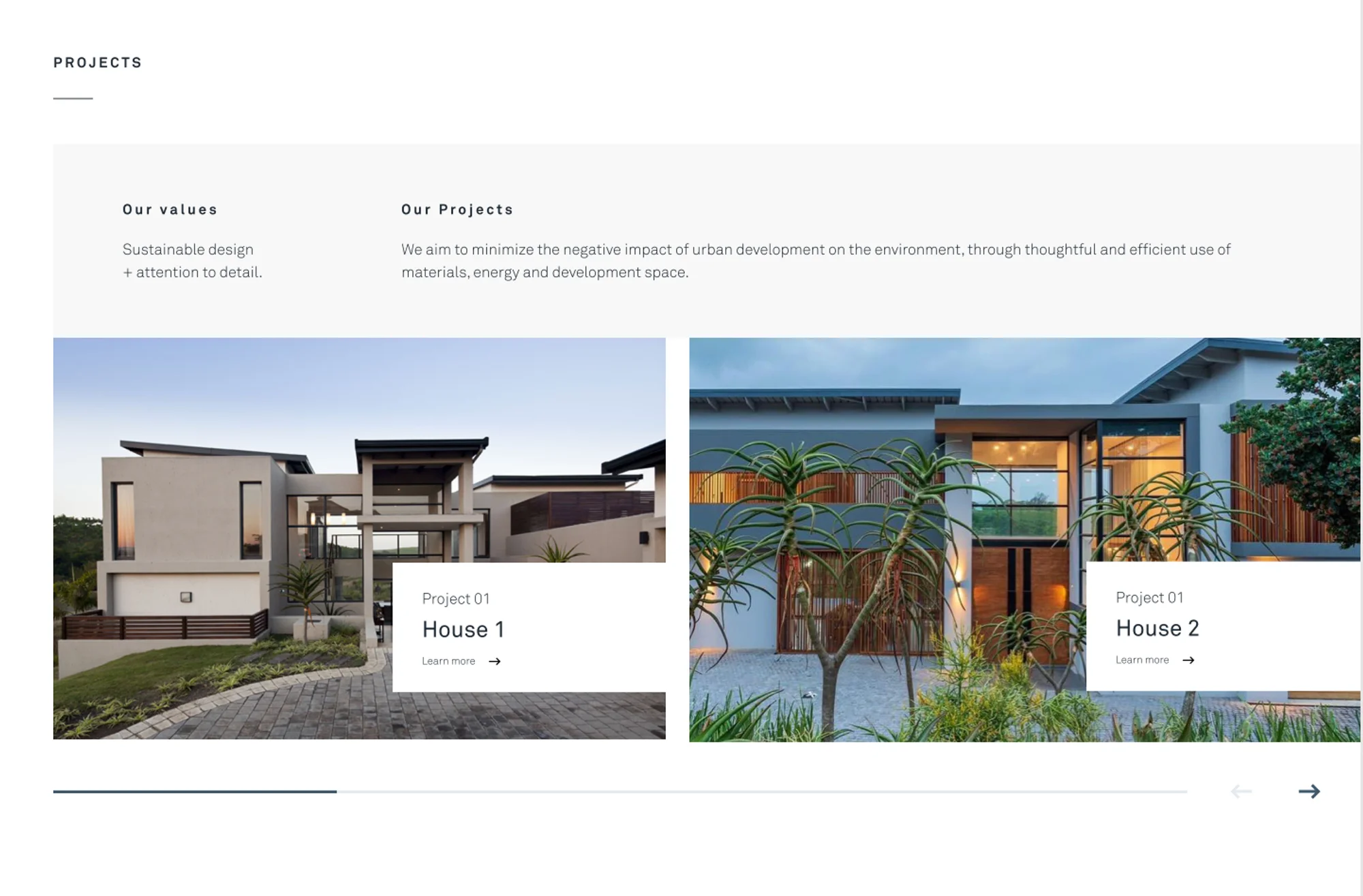
HTML/CSS sliders and carousels
Carousel meaning indicates a collection or 'filmstrip' of images that move in a stepwise or smooth manner around a central axis. It can have either a 2D appearance or a 3D-like one.
HTML embeds
The embed HTML element embeds external content at the specified point in the document. This content is provided by an external application or other source of interactive content such as a browser plug-in.
SSL
SSL stands for Secure Sockets Layer. It’s a standard security protocol for ensuring that all data transmitted between the web server and the browser remains encrypted, and therefore unreadable to the naked eye. You can tell if a website has an SSL certificate by looking at the web address: if the URL starts with “https”, the website is secure. You’ll also see a padlock symbol in the browser bar, although Chrome swapped its padlock for a settings icon in 2023, so what you see depends on your browser. Strictly speaking SSL has been replaced by TLS (Transport Layer Security), but everyone still says SSL.
UI design
UI design stands for user interface design, and it’s all about the screens and interactive touchpoints that make up a website or an app. Swiping motions, scrollbars and clickable buttons are all part of UI design: essentially anything that makes up the user interface.
UX design
UX design stands for user experience design, and it’s all about providing a smooth, user-friendly experience for the end user as they navigate around a website or an app. Here’s how a well-designed website can boost your business.
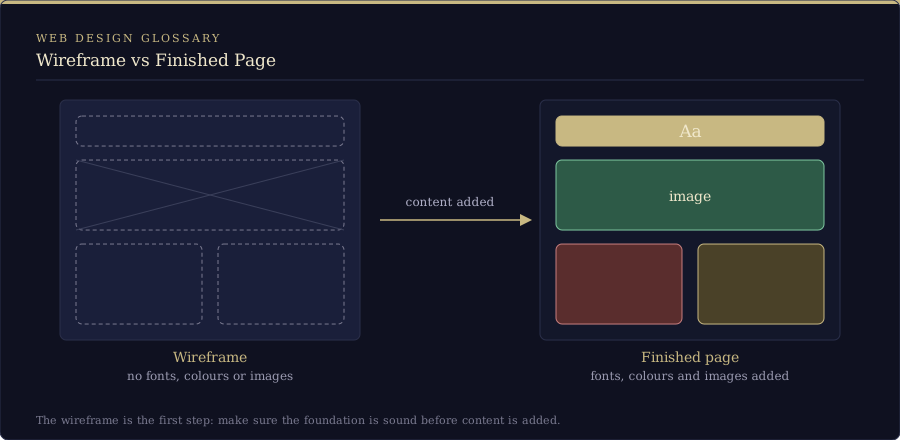
Wireframe
The structure of a website. No fonts, colours or images: this layout is the first step to making sure that the foundation is sound before content is added.
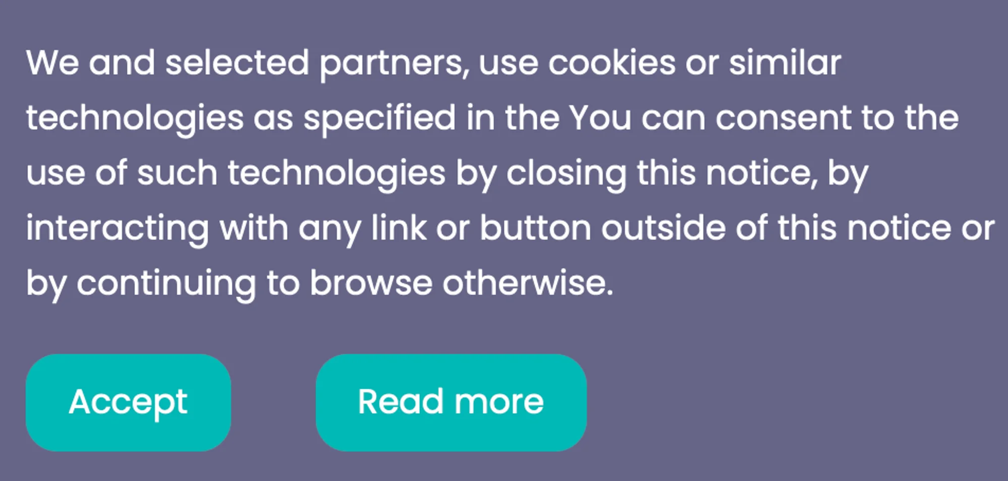
Cookies
A cookie is a small piece of data used to enable essential and other services on a website. Cookies help websites collect data on how visitors interact with sites, products and services. Cookies can also be used to store user preferences on a site. By accepting cookies, you agree to a business’ use of these tools for advertising and analytics. Wondering what a cookie banner does to your numbers? We shared ours in the cookie consent dilemma.
Parallax scrolling
A technique that involves designing the background of a website layout to move at a slower rate than the foreground when the user scrolls, creating a 3D-like effect.
Favicon
Short for “favourite icon”, it’s the icon that appears in your website’s browser tab.

CSS
Think of HTML (Hypertext Markup Language) as the skeleton/backbone and CSS as the looks. CSS, which stands for Cascading Style Sheets, is the most common way of setting the look and feel of a website. While HTML tells the browser what goes on the page, CSS will tell the browser how it should be presented, for example colours, fonts, layout and more.
SEO
SEO, or Search Engine Optimisation, generally refers to the entire practice of on-site and off-site actions that will lead to a higher or more targeted ranking on a Google search results page or that of most other search engines.
Accessibility
Refers to the practice of making sure your website can be used and accessed by all people, with all abilities and impairments.
Alt text
Alt text is the written copy that appears in place of an image on a webpage if the image fails to load on a user's screen. It’s also what screen readers read out to people who can’t see the image, and it helps search engines understand what the image shows.
FAQ
What are the most common web design terms?
The ones we get asked about most are responsive design, UI and UX design, wireframes, CMS, SSL, SEO, alt text and accessibility, and every one of them is explained above. In a nutshell: responsive design is how a site adapts to different screen sizes, a wireframe is the bare-bones layout before any fonts, colours or images, a CMS lets you edit your own content without a developer, and SEO is everything you do to rank higher in search results.
What is the difference between UI and UX design?
UI design is the look and feel of the screens and touchpoints, like buttons, scrollbars and swiping motions, while UX design is how smooth and user-friendly the whole experience is as someone moves around your website or app. UI is what people touch, UX is how it feels to use.
What is the difference between responsive and adaptive design?
Responsive design is fluid: it reconfigures every design element to fit whatever screen it’s viewed on. Adaptive design uses several fixed layouts and picks the one that suits the user’s screen size. We lean towards responsive at Milk Moon, but sometimes mix in an adaptive element where a section just won’t work on mobile.