Today we thought we'd share the contents of the Milk Moon Studio Design Feedback Requirements and Tips from our Notion projects. We use this page in all our Notion Projects to help clients give better feedback and to allow us to give better reverts to said feedback. It's useful for our two biggest pain points when it comes to design, project timelines that are out of whack and cost overruns. We hope that you'll find this useful with your clients, or if you're the client, giving better feedback to your designer.
Here's a link to the actual Notion Page should you wish to duplicate the file. We've spent quite a bit of time gathering tips from different sites over time, so while we'd love to credit everyone here, we honestly can't remember all our sources. Finally, if you felt we left anything out or have more tips, please, please add them in the comments, we'd love to learn more.
Without further adieu, here are the Milk Moon Studio requirements and tips for good design feedback verbatim:
Great feedback should be communicated in a way that allows us to apply it to your project to make it even better.
We generally allow for two rounds of design feedback. After your usual two rounds of feedback we can bill for more changes at our usual hourly rate.
💡 We ask that you compile all your feedback and then let us know that you’re ready for us to review the feedback.
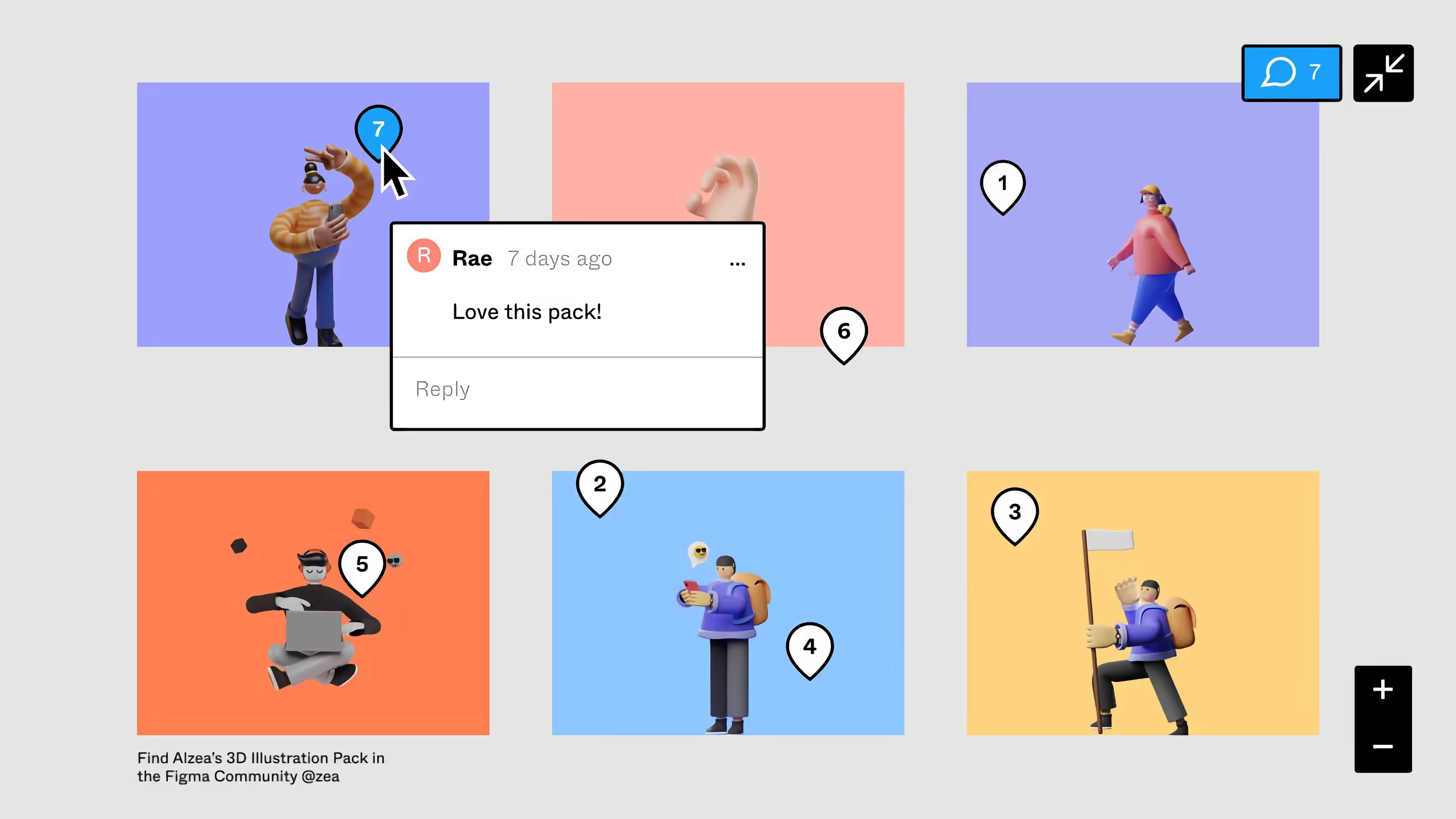
We will always give you access to your Figma file and allow you to comment right on the designs using Figma in either your browser or using the Figma Desktop App. If you use Slack we’ll already have added you to a Slack channel, though we would strongly suggest you add your comments in Figma as that allows us to:
- Know exactly what element you’re referring to when you give us feedback.
- It allows us to “Resolve” comments and threads so both you and us know something has been taken care of.
- Keeps everything in one place.
💡 If you’re not familiar with Figma you can read the below guide on adding comments to Figma. Also, remember that you can @ us in a comment to make sure that we know who it’s for or if you’re directing it at anyone in particular at Milk Moon Studio or on your team.
Guide to Adding Comments in Figma Files
You are more than welcome to consolidate your comments in Slack or via email after you have commented in Figma, and then let us know that the feedback for a page has been completed.
Bullet points are best, ideally one for every item that needs to be addressed. This is much more effective than providing a paragraph-based dialogue on what needs to be changed. If you’re finding it hard to covey your vision, make a Loom video, you can record your screen and tell exactly what you want.
💡 If you’ve never used Loom, it’s super easy, you can find out more info on getting started here.
💡 NB! Try and get all your feedback into your design review and your 2 feedback rounds. Once we start building your site in Webflow changes take a lot more time, and that in turn changes the original estimates in the quote you signed off, which in turn drives up the final costs of your project. We’ll always tell you if your project is running out of it’s allocated hours and we track this meticulously. If we do run into issues we’ll discuss it with you and decide how to proceed.
What does your design review round look like.
2 round revision & approval model.
First round: Identify major issues and provide feedback to address them. If you're presenting a design to stakeholders, use the first round to get the design to a stage where you think we have nailed the brief. This should give it the best chance of success when you take it to other stakeholders.
Second round: Confirm that the changes made have resolved the issues identified in the first round; tweak and respond if they don't. Ensure the design composition is balanced after addressing latest changes. Get any stakeholder feedback required and consolidate into one final group of changes. Let them know there is only one chance to give feedback. If your project is time sensitive, provide all stakeholders with a feedback deadline.
Approval round: Approve the design tweaks and move forward.
Ideally, major issues should be discussed immediately, minor tweaks can be provided at both the first and second round. The approval round should be near perfect if you have thoroughly reviewed in previous rounds and this is where you’ll sign off the design for dev.
When a design pushes into a 4th, 5th and 6th rounds of revision there is clearly a problem that has to be addressed.
💡 It is important to remember (particularly on a website project) that excessive rounds of feedback can throw a project plan (and a design!) out of whack and potentially result in a delay. To avoid this cringe-inducing scenario (a project manager’s worst nightmare) we ask our clients to deliver feedback that’s representative of the client team’s final opinions. We suggest having one team member be “responsible” for delivering feedback, but ensure those who need to be “consulted” had a chance to voice their opinions.
💡 Please note that each feedback message/email is seen as a revision round. Please provide all feedback and/or revisions within 2 days (48 hours) of receiving the draft unless otherwise stated in your timeline or contract.
Tips For Feedback Pitfalls
Vague Comments
The three worst words we can hear can hear: “Make it pop.” It just doesn’t mean anything. Vague design feedback doesn’t give us, your designers, enough information to move forward. A lot of times these comments are based on gut reactions.
“I just don’t like it.” Alright, well why?
“This looks weird.” What does weird mean?
“Make it better.” Is that one thing? Or a bunch of things?
💡 Keeping things vague adds an unnecessary level of guesswork to your design process. Without clear direction, we are in the dark about your vision, and your final design will suffer. “I don’t feel any emotional connection to this hero image. I worry it won’t engage our core audience” is far better than “make it pop”.
Be Specific
Be very, very specific. Describe exactly what you’re looking for. Is it a color issue? Is the layout weird? Is the font a little stale?
Instead of “make it pop,” you could say, “I need the title to stand out more. Could you give me some other font or color choices?” Or if words are failing you, use very clear visual examples that illustrate your design direction. Find something that “pops” for you, and tell your designer what you like about it.
💡 In short, figure out exactly what your gut reactions are and use clear words to collaborate with your designer to find an awesome solution together.
Impossible requests

When we read read your brief, the only goal is to make your creative vision come to life.
But that means you have to be reasonable. Even though it’s art, design does have rules and not everything is possible.
Certain colours and shapes just won’t work together. Sometimes you can’t fit every single thing on one page
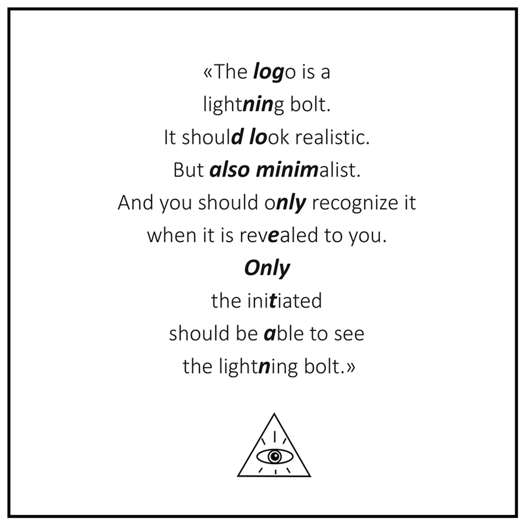
And a lightning bolt logo can’t look realistic, minimalist and “hidden” all at the same time. It’s an impossible request.
Ask Questions & Listen
We like to think we know what we’re doing and sometime we might push back when your creative vision just isn’t feasible or if we think we’ve found a better solution.
Ask us lots of honest questions, but trust us to know the best way to approach your project. If you don’t understand something, feel free to ask why. By working together, we’ll be able to create something that we’re both proud of.
Confusing direction
Being confusing is just as bad as being vague.
Big descriptive words are great for kicking off a brief and providing creative inspiration. That’s when you can invite us to really be inventive.
When you’re in the feedback stage though, you’ll want to be super clear. At this point, flowery words might mean one thing to you and another to us. Confusing feedback like this will lead to an endless chain of revisions that will result in your frustration and burn-out for us
Just say what you mean. Try to compose your feedback in the simplest possible way. If your design needs “more testosterone,” for example, tell your designer what that actually means to you.
💡 Just say what you mean. Try to compose your feedback in the simplest possible way. If your design needs “more testosterone,” for example, tell us what that actually means to you. Is it “less pink and more blue”? Is it “sharper lines and fewer curves”? Is it “a can of Miller Lite, a pickup truck, and a smoking shotgun”? Be specific or we’ll have to guess and make the decision for you.
💡 Don’t know the right terminology to describe what you need? 99Designs have created a great list of 99 descriptive designs words to know. You can find it here.
Frame Your Feedback With Context
The most important thing about design feedback is that it must always remain framed by your project goals and metrics for success.
When you give feedback, make sure its underlying motivation is aligned with these goals.
Describe problems, don’t offer solutions
This might sound very harsh, but is also one of the biggest feedback pitfalls. Instead of providing the how, provide the why.
💡 It’s our job to figure out the how. Instead of the prescriptive request “make the logo 50% bigger”, try “as a new company with little brand recognition, we need to make sure potential customers become familiar with our brand as much as our products. What can we do to make our branding stand out more?”
This doesn’t mean offering suggestions is off the table. But you need to frame them as suggestions for one possible solution to explore and compare.
Stay objective
This one can be really challenging for some people because our personal preferences are so innate to our decision making process. But you are not your customers. Your preferences have very little weight unless the product you’re designing is made for you as the sole user. When providing feedback, it’s vital that you remove from the equation as much of your own aesthetic preference as possible.
Instead, focus on what your customers will like. What makes them feel they can trust your you. What makes their lives easier. Your subjective impressions rarely impact heavily on those goals. There should be very little need for comments like “I don’t like this”. Instead, think in terms of “our users may not understand this”.
💡 Stay objective and aligned with your project goals at all times.
We really hope these tips help and that it’ll make the review process as simple as possible. Simplicity + clarity = kick-ass design.
Your Review and Feedback Checklist
- [ ] Make sure to check the design file we supplied to you for comments from us before you begin giving feedback.
- [ ] Look at the prototypes if we’ve supplied, if any, these can show you how interactions and animations etc. behave on your finished project.
- [ ] Comment on everything we’ve supplied for review so all your feedback is consolidated before you notify us that you’re done with your feedback.
- [ ] Get feedback from other stakeholders before we end up in the final approval round and compile that into your consolidated feedback to us.
- [ ] Try and make sure you’re happy with what you want changed at this stage in the process when you notify us that your feedback is ready for us to review. You don’t want end up in a situation where we’re making changes to something in a 3rd of 4th round of changes on something that’s been sitting in Figma since the very start.
- [ ] If you’re struggling, make a Loom to explain what you mean and link to it in your comments on the design file.
- [ ] Let us know you’re ready in either Slack or via email.
- [ ] Very important, your project will have a timeline in Notion, please provide the feedback we asked for by the required date we asked for or your project timeline breaks down.
💡 Once more: Please note that each feedback message/email is seen as a revision round. Please provide all feedback and/or revisions within 2 days (48 hours) of receiving the draft unless otherwise stated in your timeline or contract.
Small Webflow studios like us and Webflow experts don't have the time to struggle with endless rounds of feedback, we hope this helps you as much as it did us.


